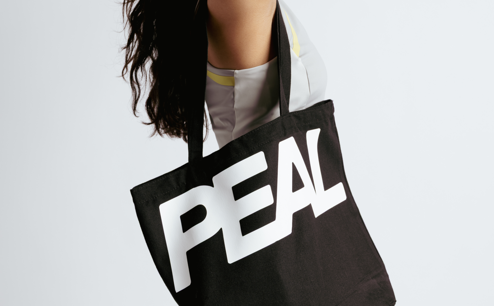
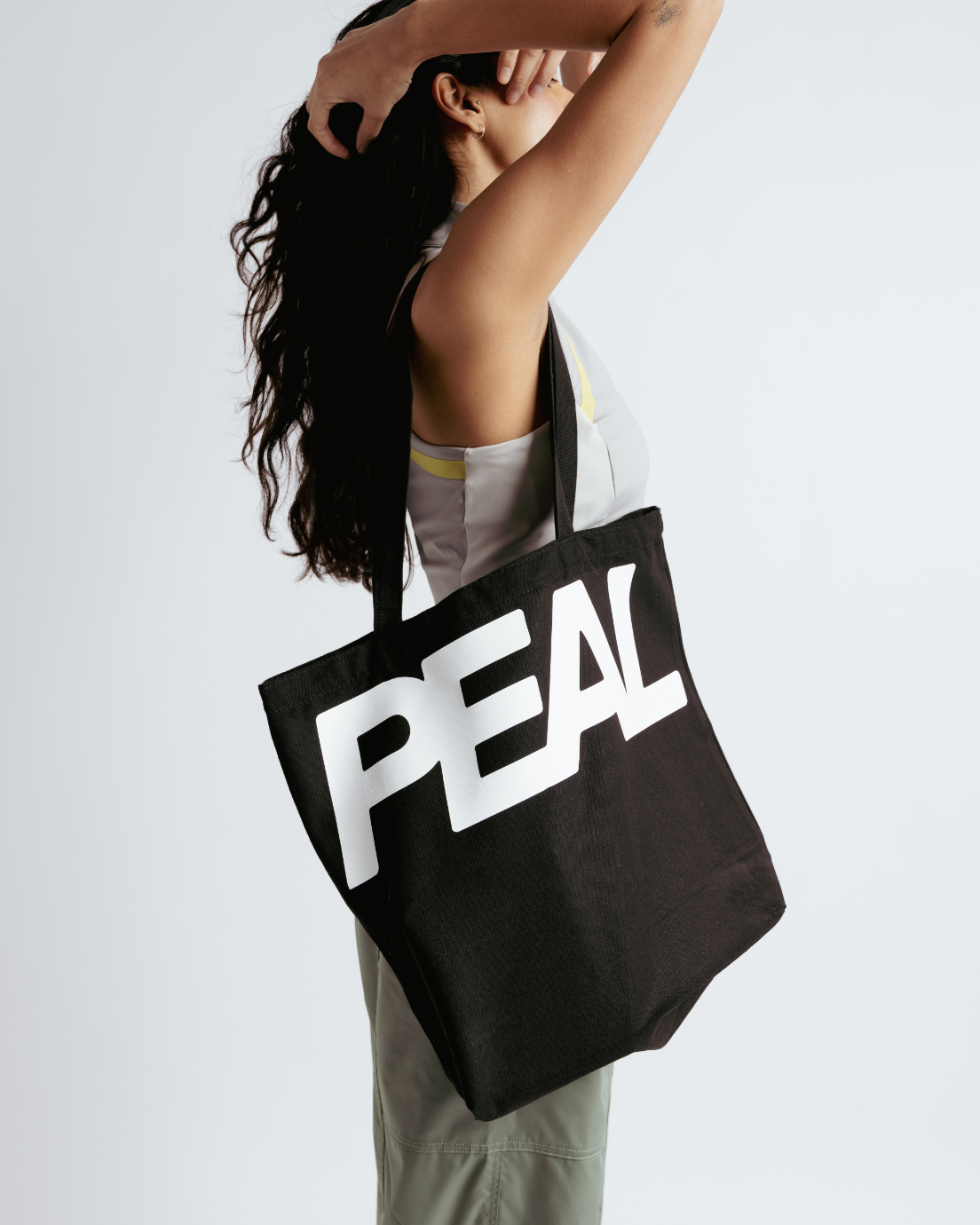
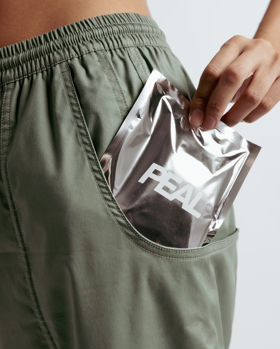
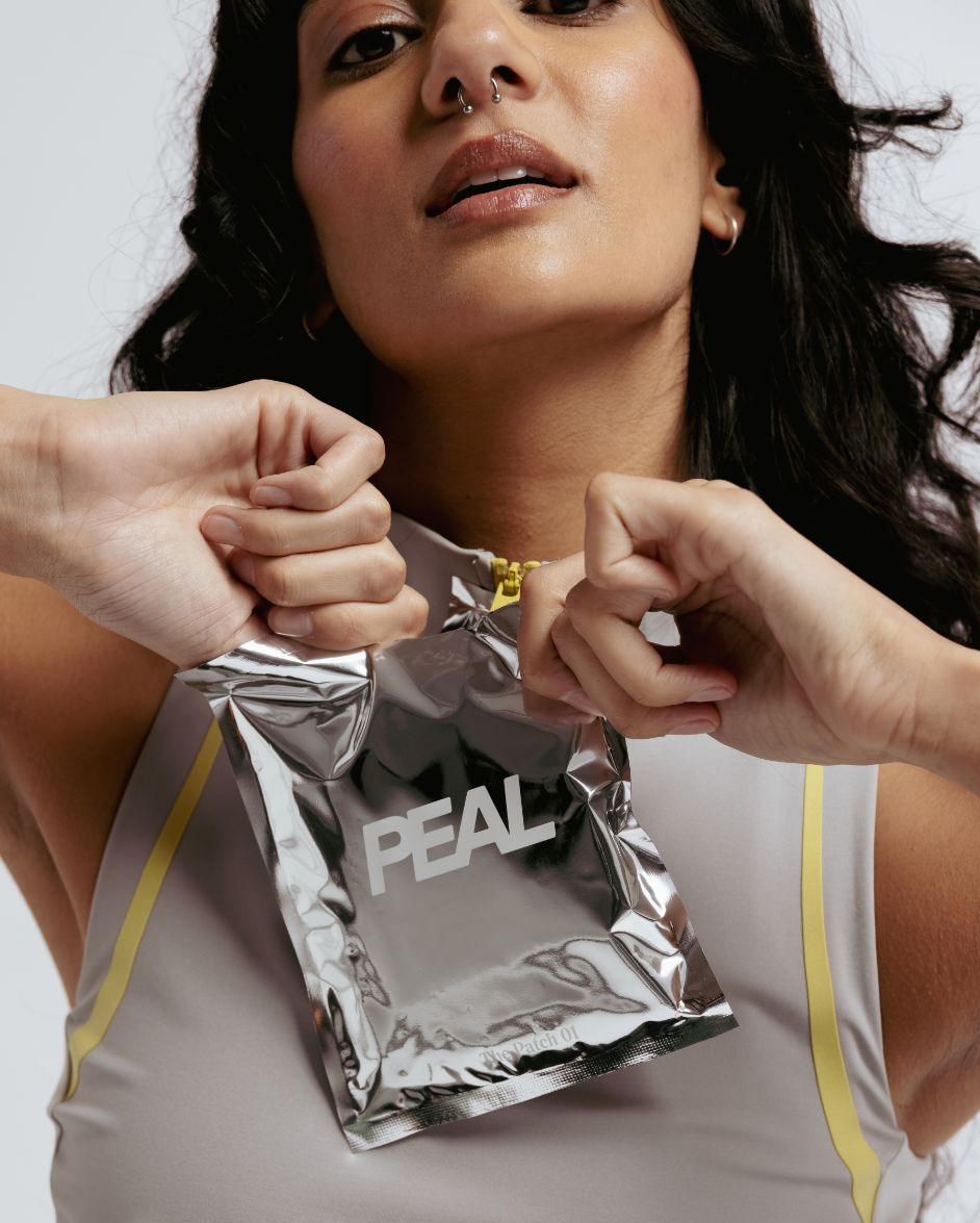
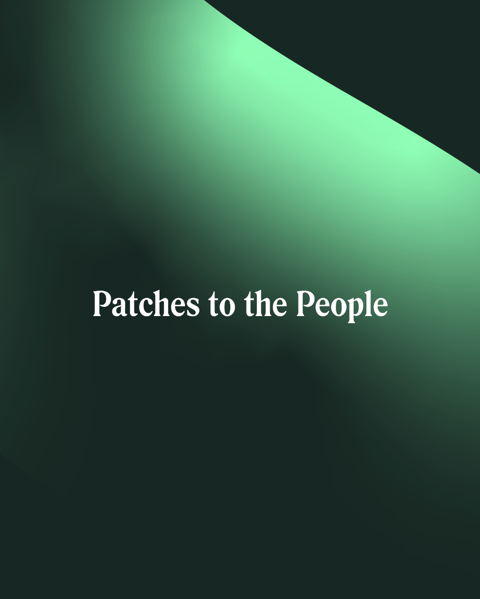
With Peal we wanted to create a brand that had some fist-in-the-air energy. Peal means patches to the people, patches that heal! This is not a curl-up-on-the-sofa product, it’s for getting out and living life. Based in Kuwait, their name needed to capture this practical but empowering support in a tasteful way.
Services & Details
- Creative Strategy
- Brand Naming
- Visual Identity
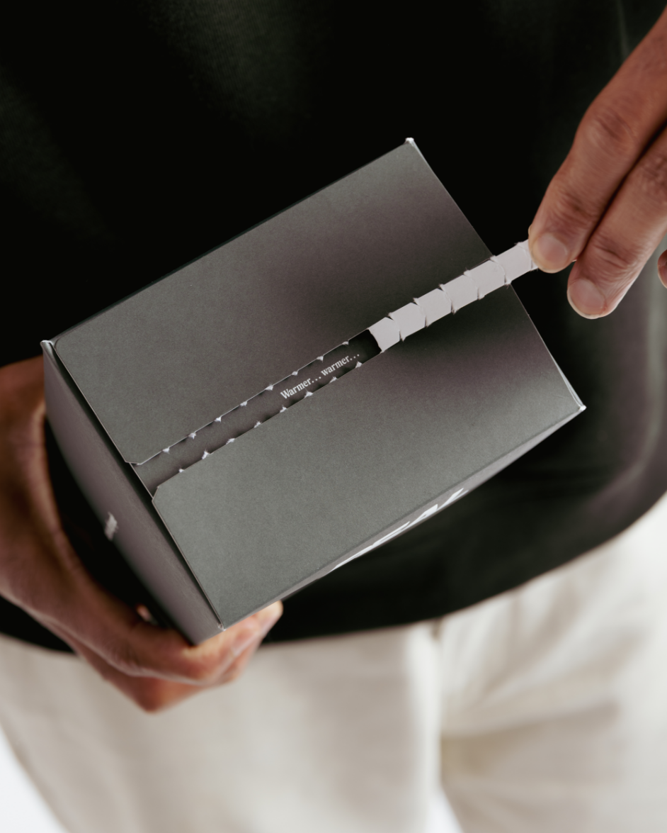
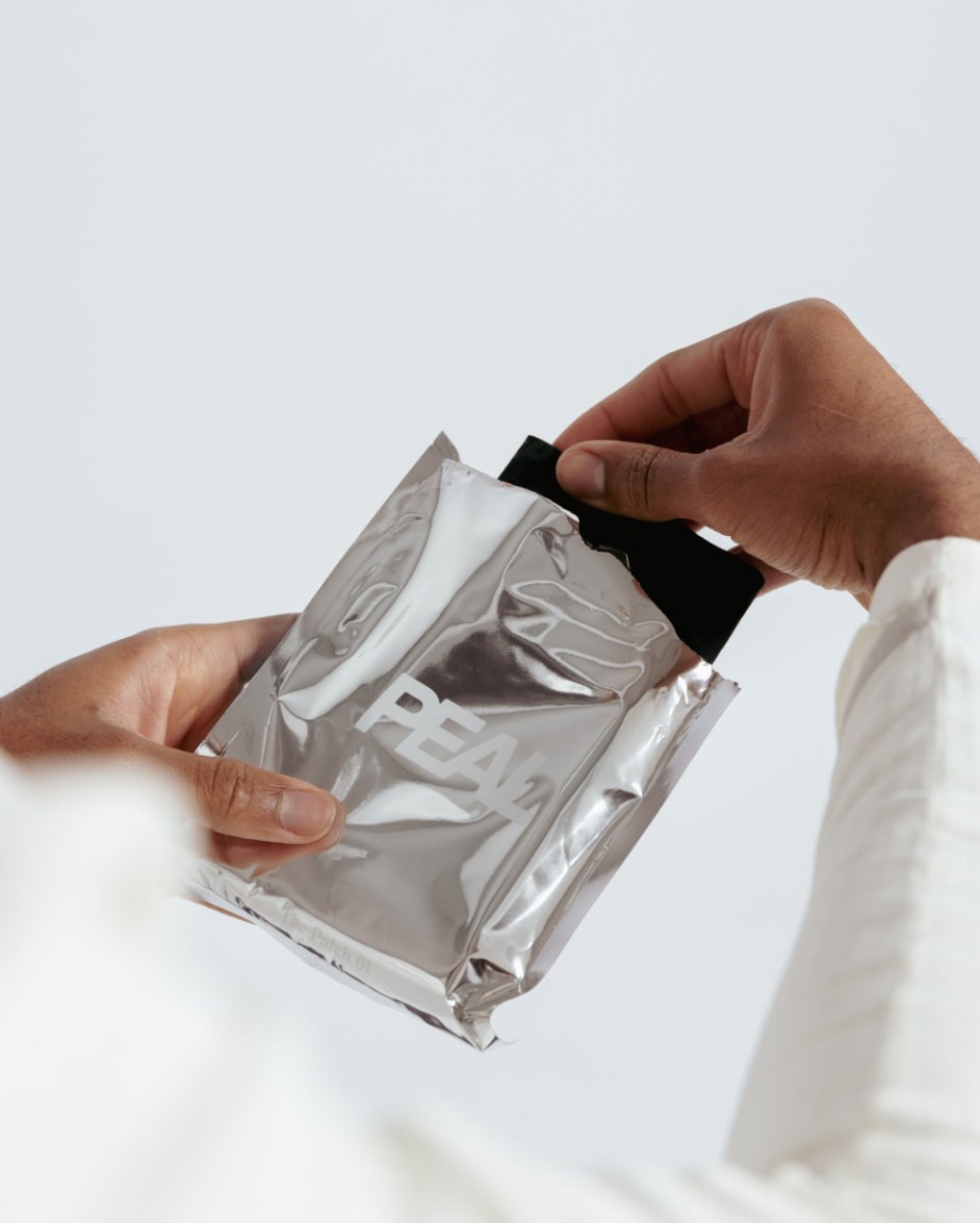
- Packaging
- Art Direction
- Period-care
- Kuwait
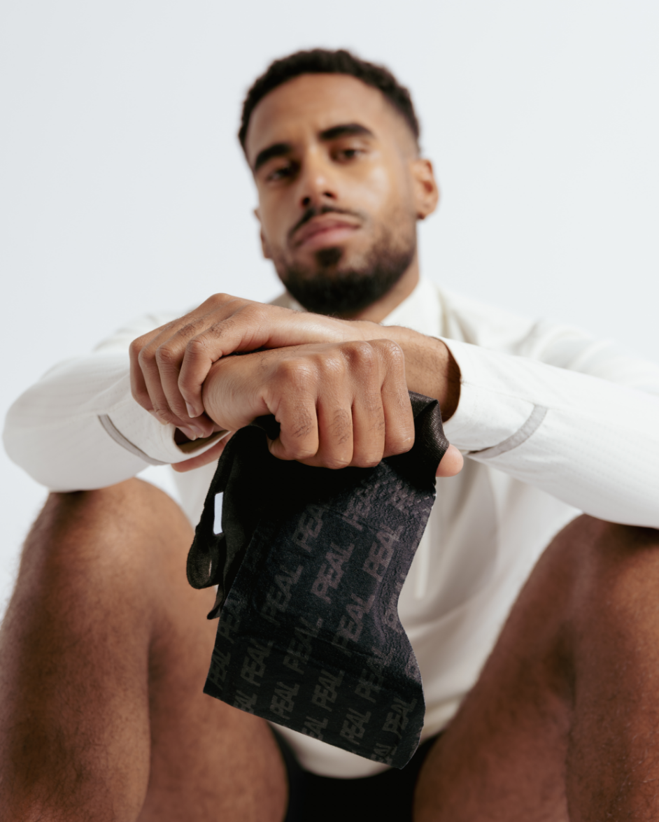
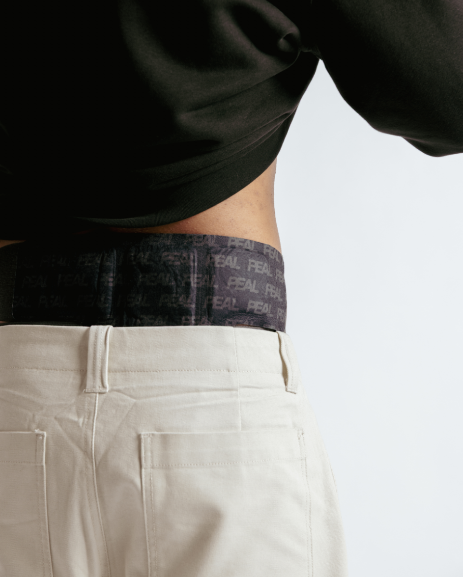
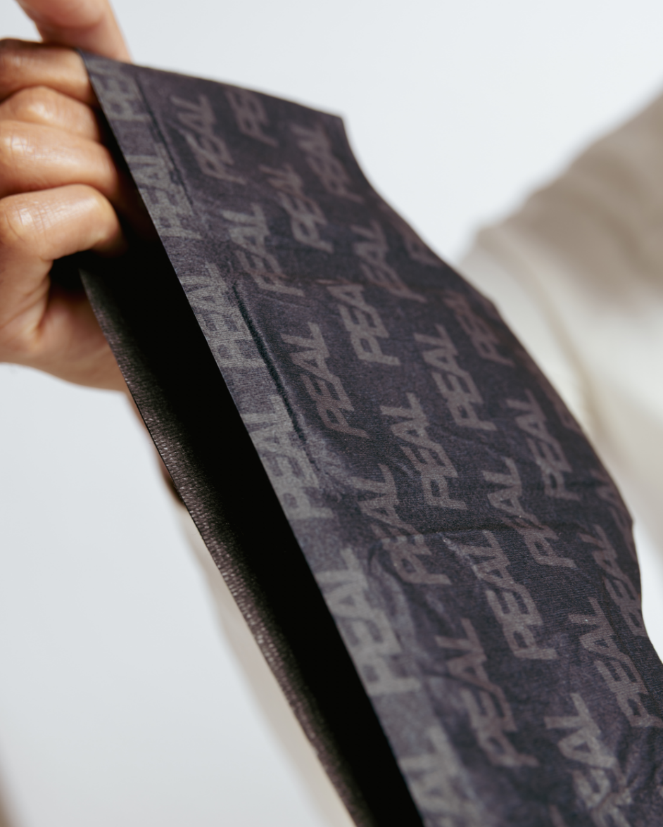
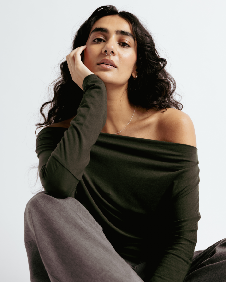
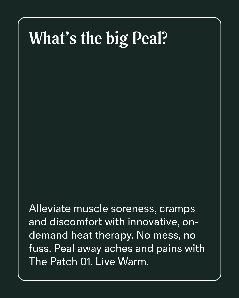
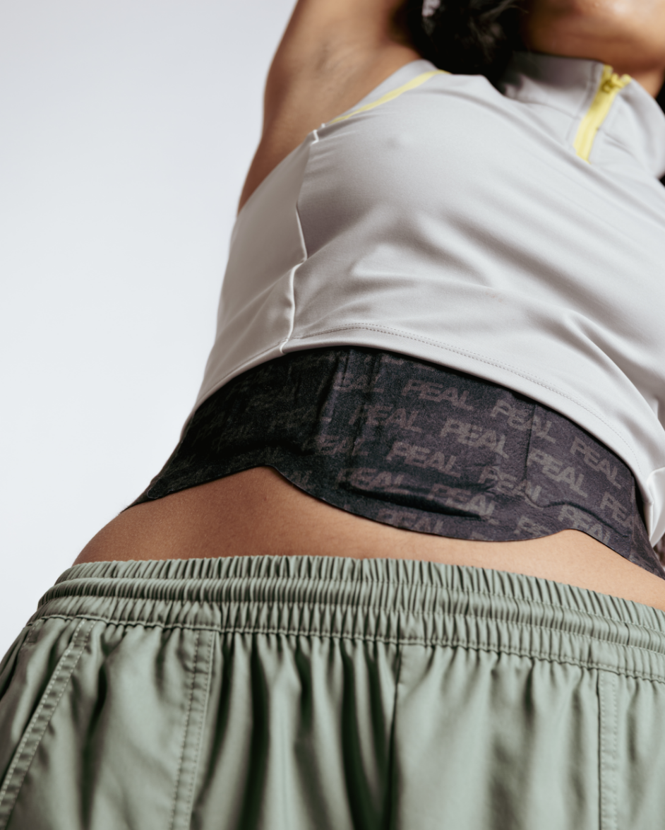
We worked with the founder to take a disruptive idea to a state of complete launch-readiness. The basis of the visual system is a punchy wordmark. Designed with curved details that reference the patches themselves, it’s strong, confident and approachable. Cutting-through this are soft graphics inspired by the shapes formed in the light and shadow of the human body. Further energy and depth are introduced through the art direction, colour, typography, and layout.
Project Images



Navigation to previous or next project
Credits
- Rose Gordon
- Thomas Seddon
- Olivia Wheldon
- Mariana Barba
- Handover