Design Truth provides community, resources and recruitment for industrial design. It exists to make industrial design a nice place to be. Unusually, this rebrand wasn’t about trying to catalyse growth. It was about capturing a let’s-push-things-forward identity, giving their community a visual world that they’d want to rally round.
Services & Details
- Strategy
- Visual Identity
- Verbal Identity
- Digital
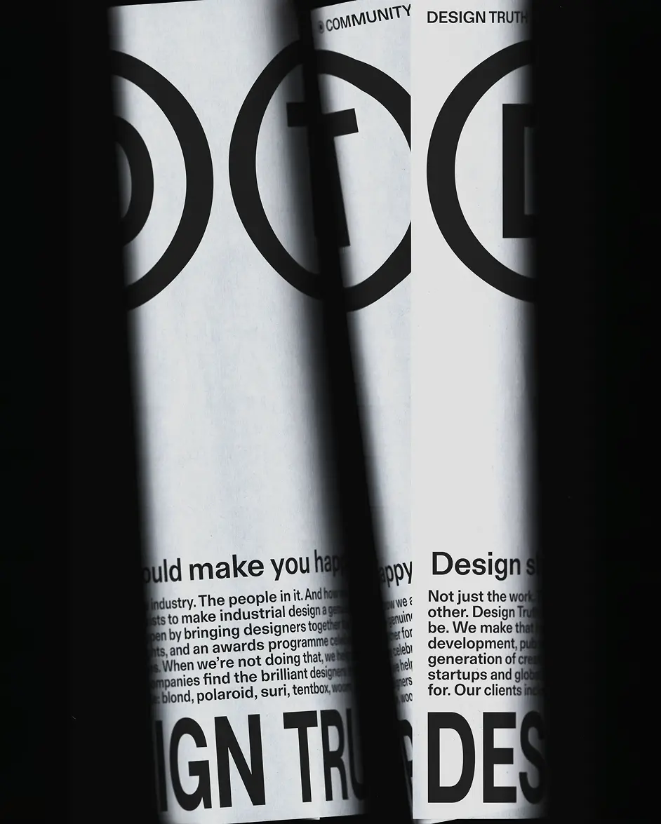
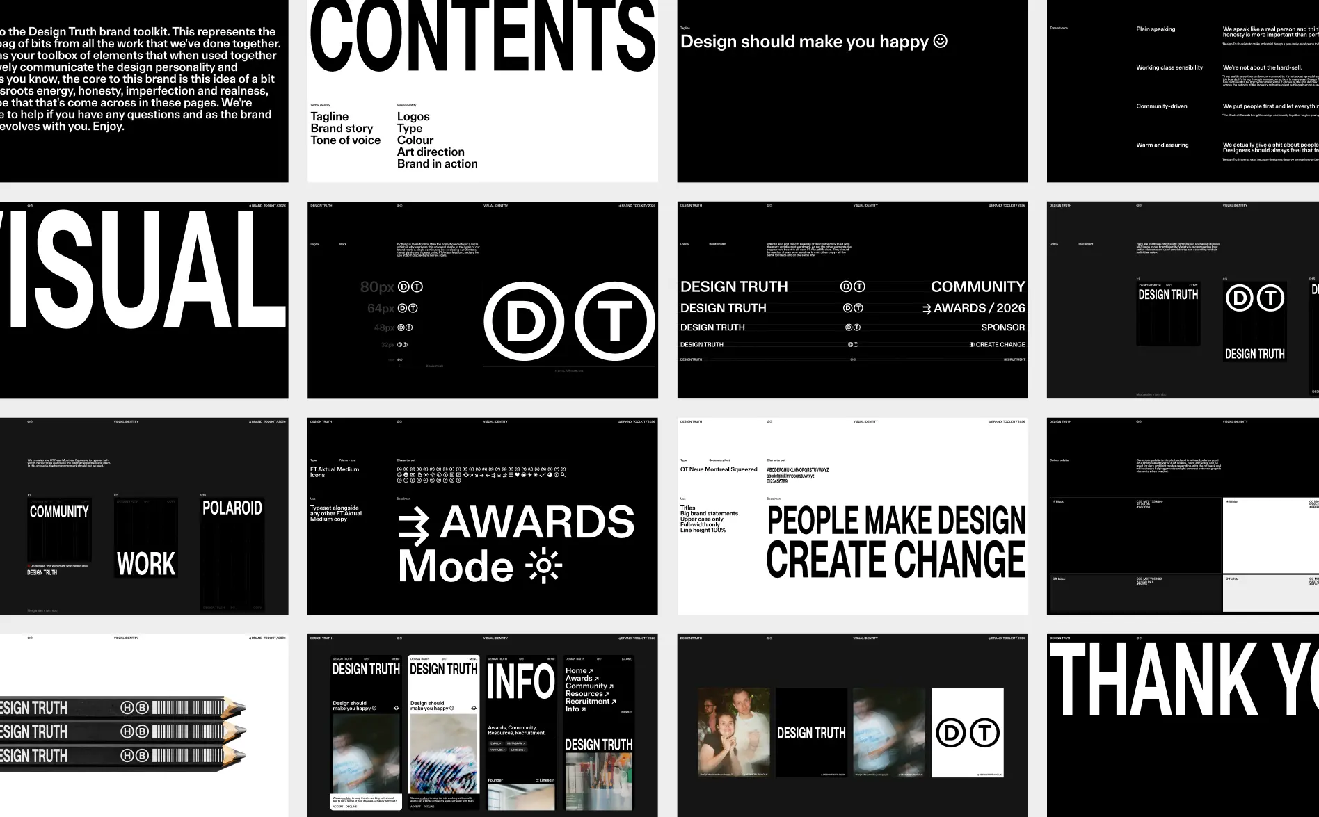
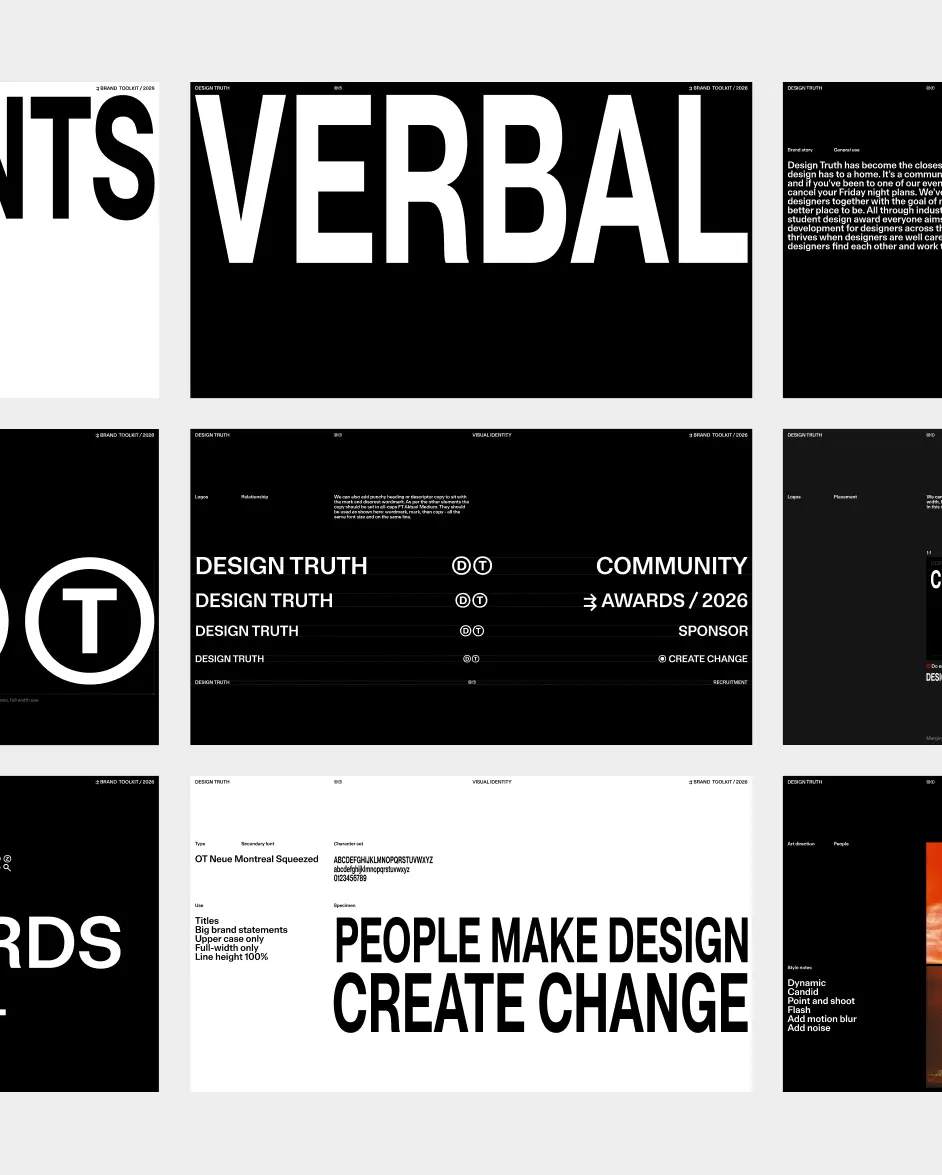
We were drawn to their grassroots spirit, and wanted to capture that through a DIY-inspired aesthetic. If you were making something yourself with limited resources or skills, what font would you use and how would you use it? Probably something like Arial; stretched, distorted, and awkwardly spaced. FT Aktual was perfect for this. A modern grotesque with similar qualities to Arial, but with better provenance and more character. We used the Medium cut with a tight line height across every level of hierarchy to suggest an economy of resources. OT Neue Montreal Semibold Squeezed brought an imperfect quality to display type and combining FT Aktual’s distinctive glyphs with copy made language more playful.
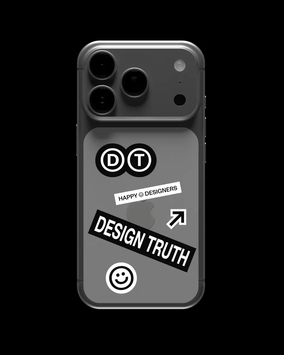
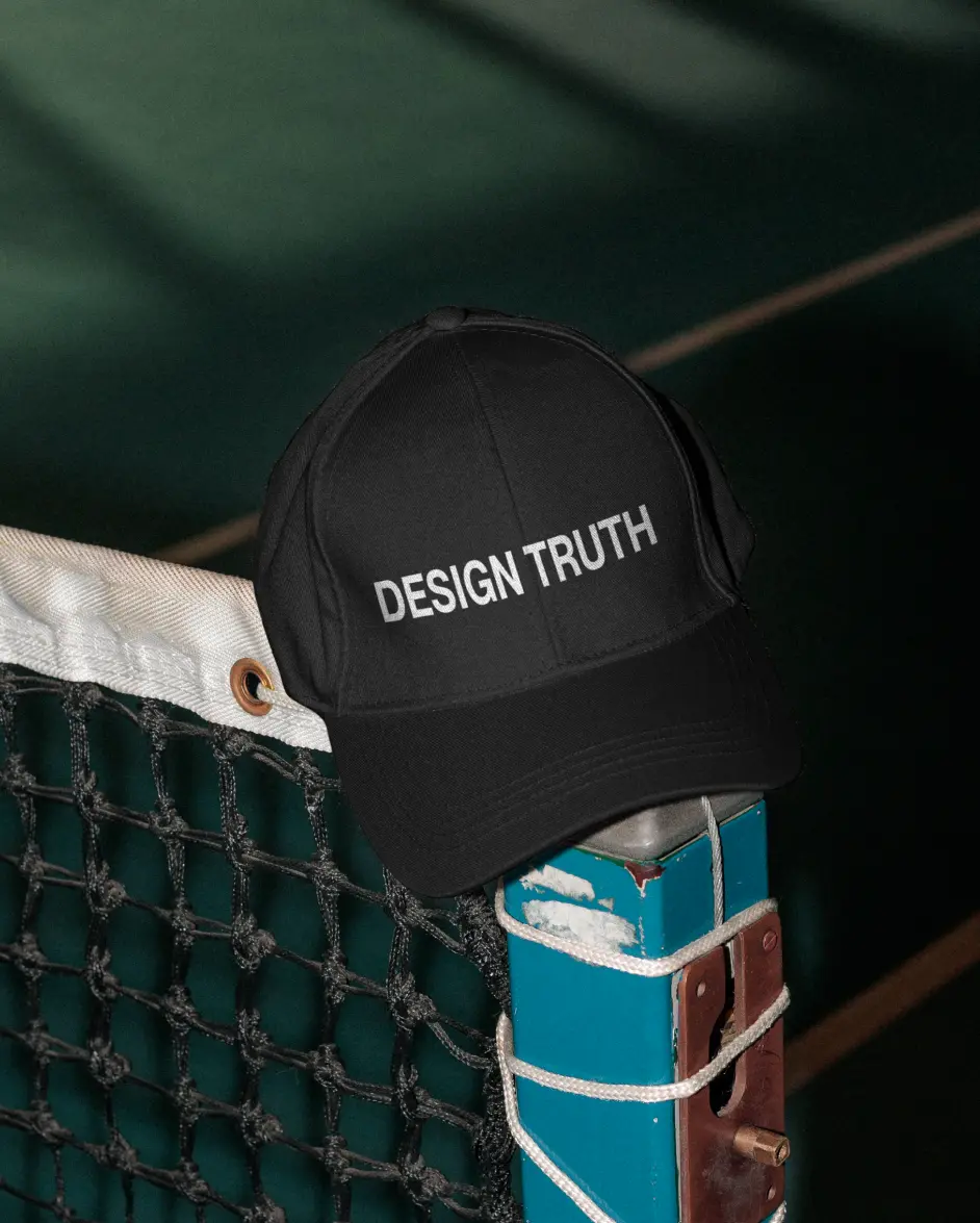
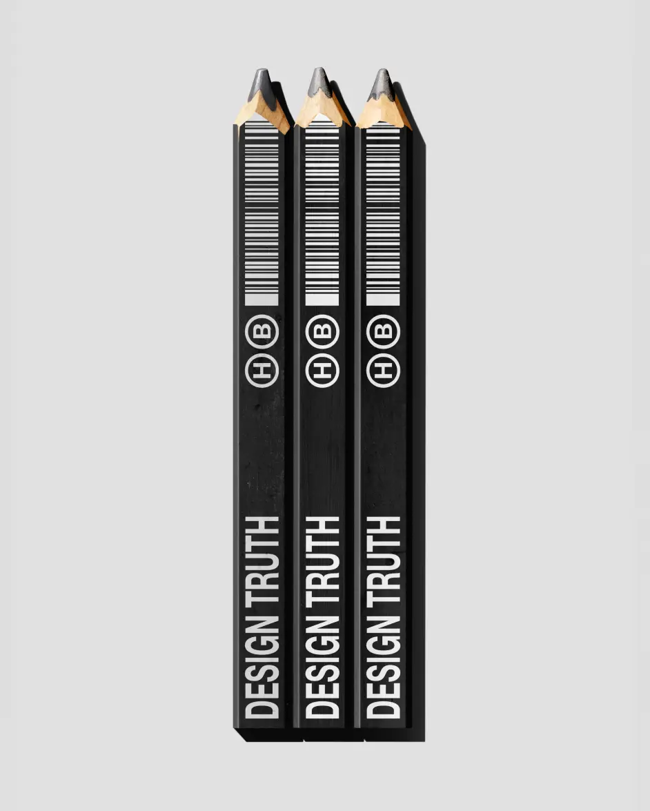
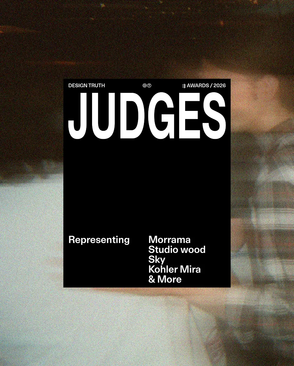
The black-and-white palette followed the same thinking: something you could put through a photocopier when making your own flyers. Grain, motion blur and a point-and-shoot feel carried that idea into the art direction. We developed the complete brand language around “design should make you happy”. People-first, real and free from corporate LinkedIn jargon. And this is what made the project so interesting: the contradictions. Branding, but not. Recruitment, but not. The outcome captured some of this and as a result feels different to anything else in the category.
Project Images
Navigation to previous or next project
Credits
- Thomas Seddon
- Rose Gordon
- Sam Watts
- AJ McGee
- Mariana Barba