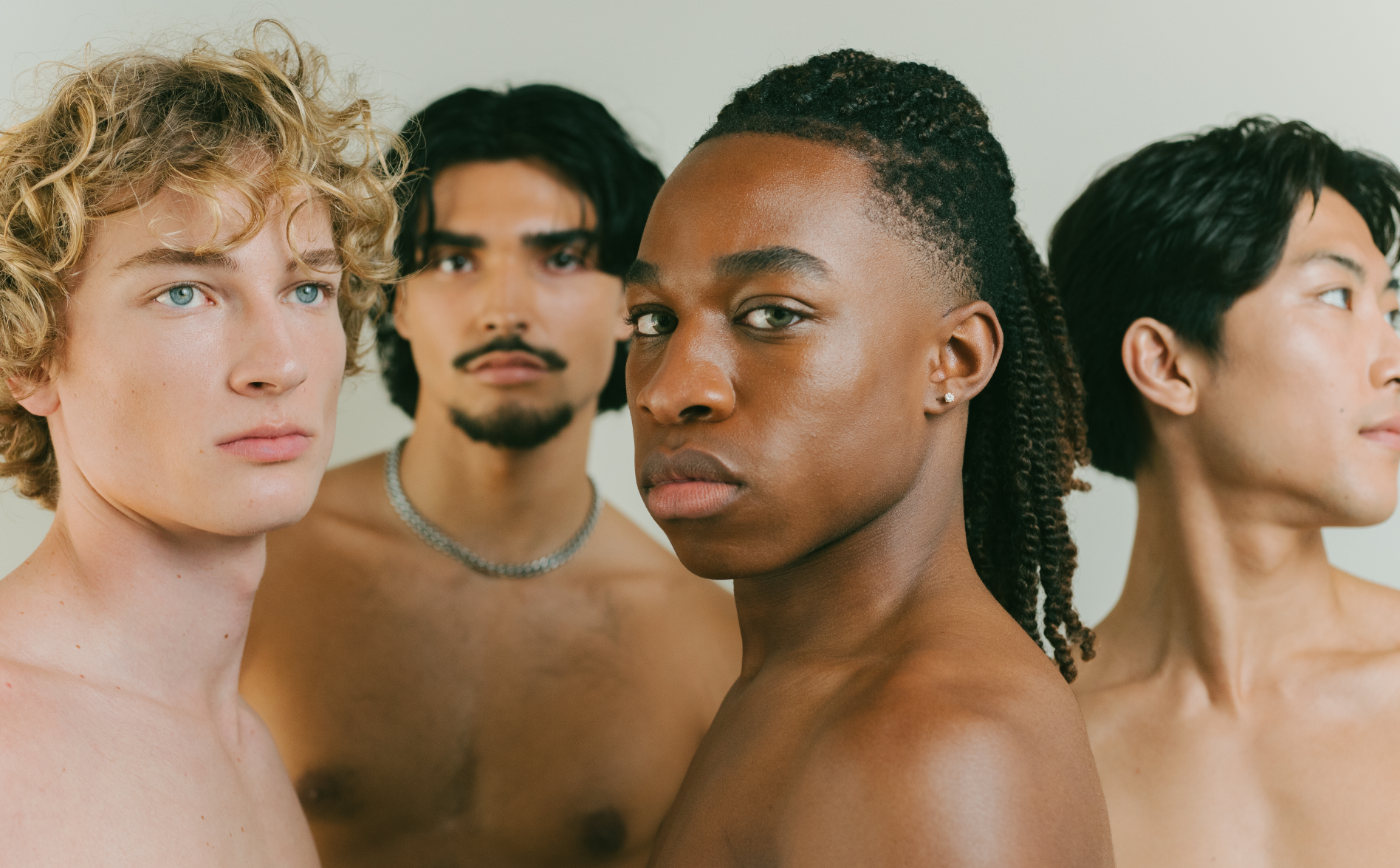
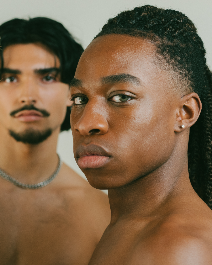
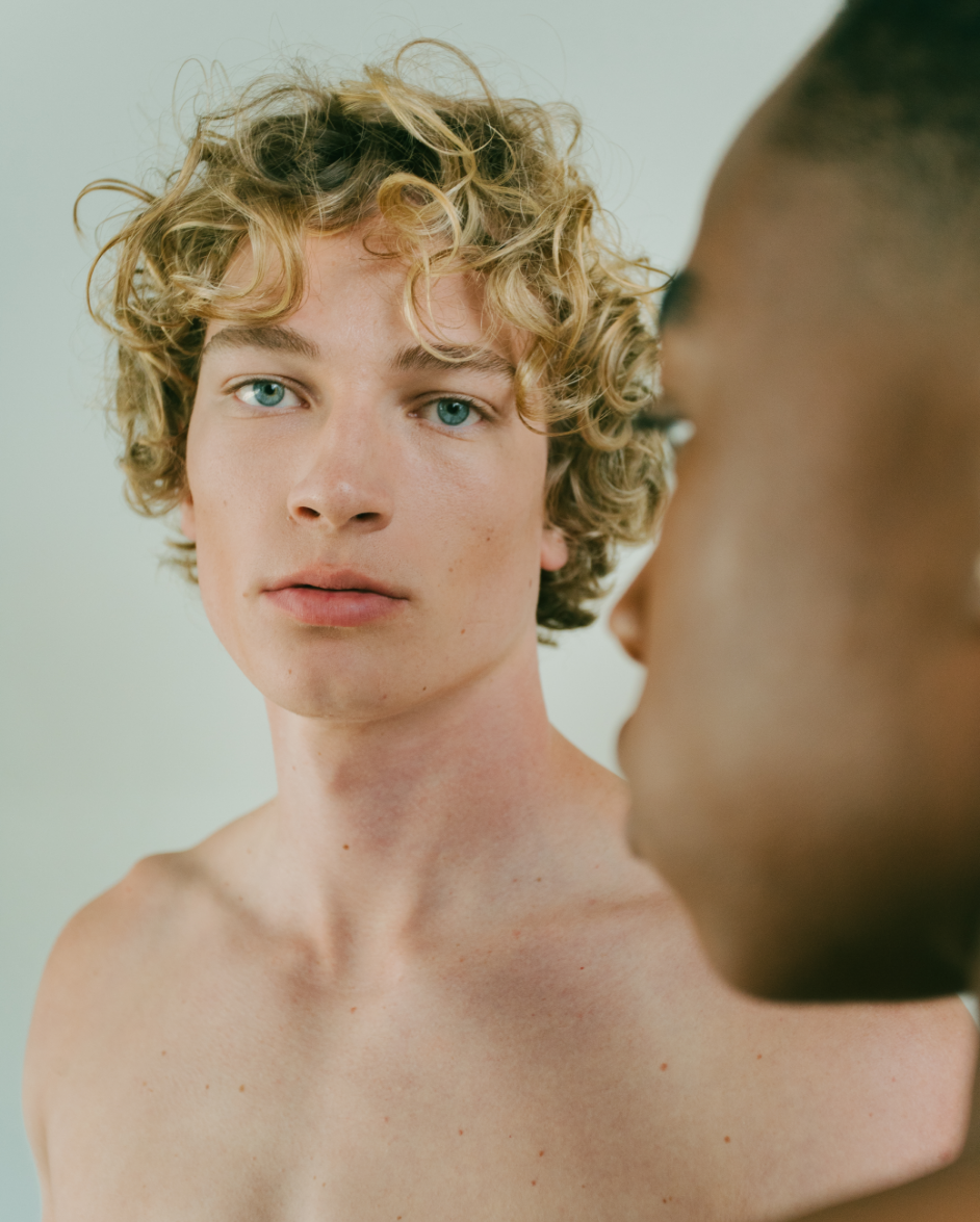
Kint celebrates what’s real through male-focussed products that educate customers on the purpose of every ingredient and the value of their unique story. Kint is a synthesis of the founder’s Moroccan and Japanese heritage, and their dedication to craftsmanship and complex procedures to create something meaningful and beautiful.
Services & Details
- Brand Naming
- Visual Identity
- Packaging
- Digital
- Female Founder
- Inclusive
- USA
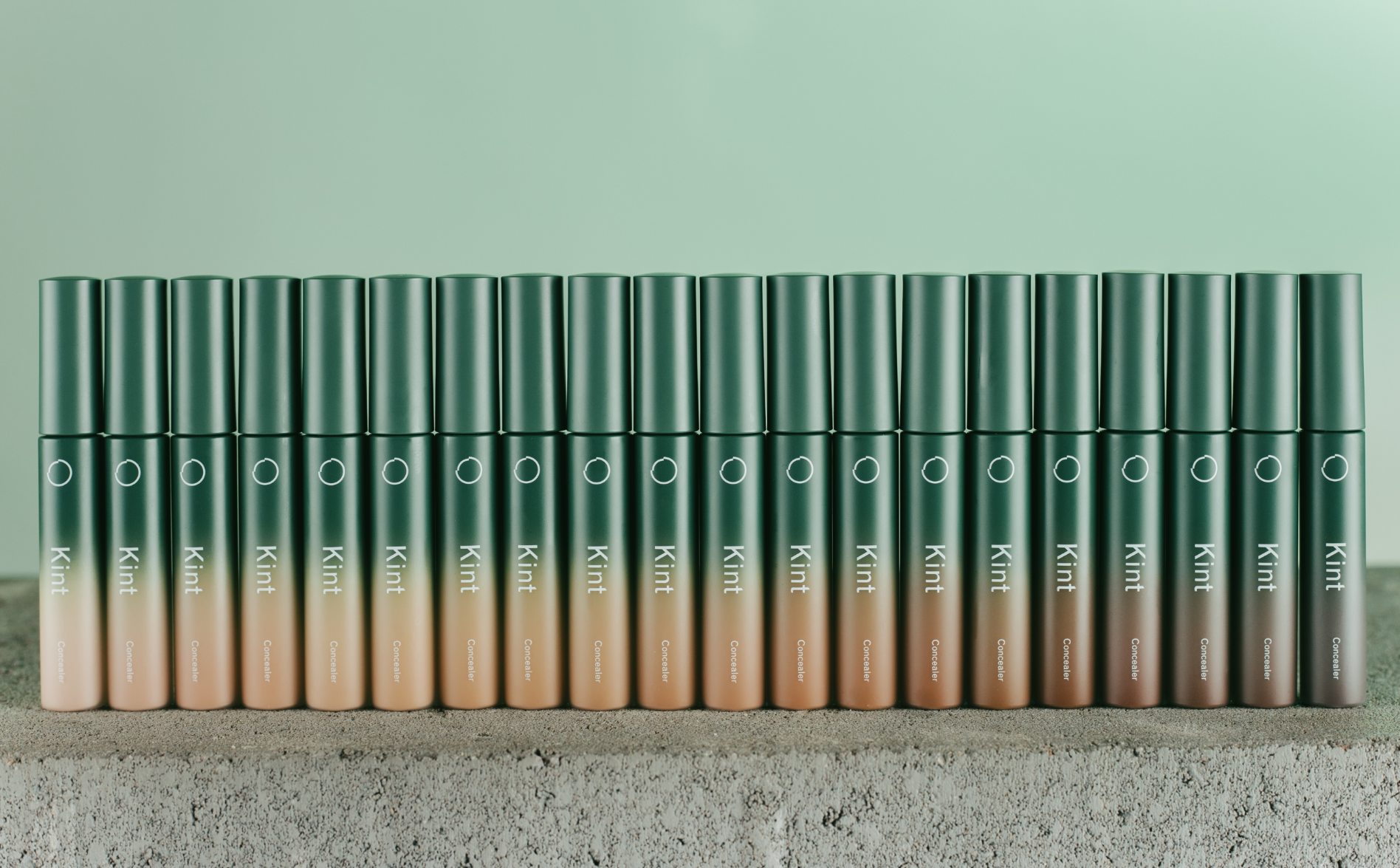
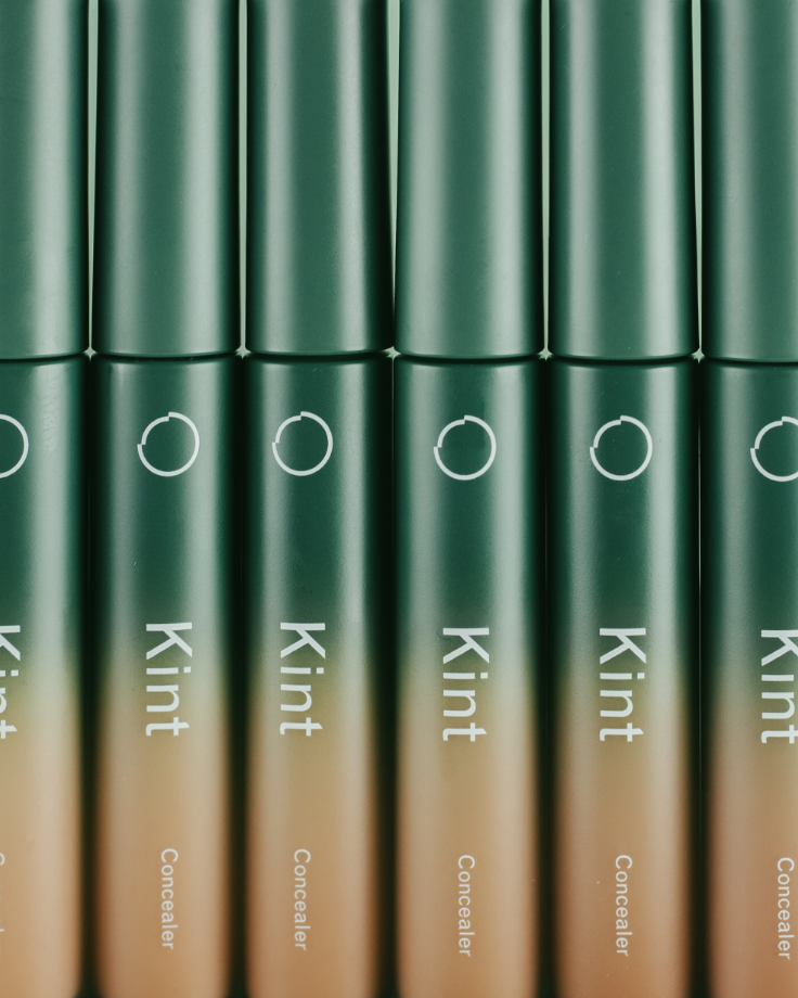
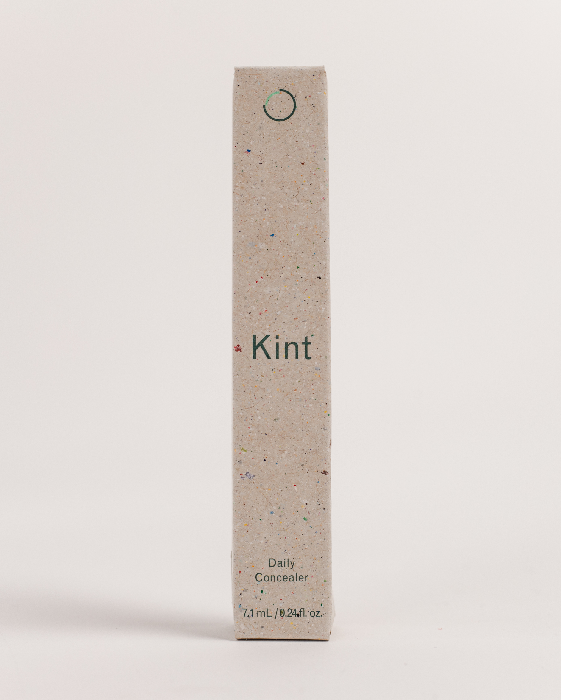
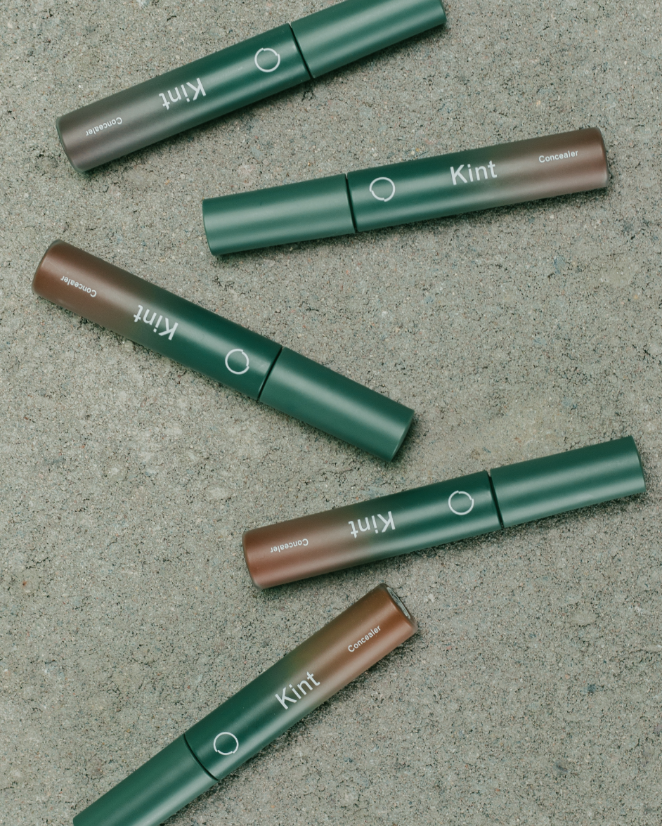
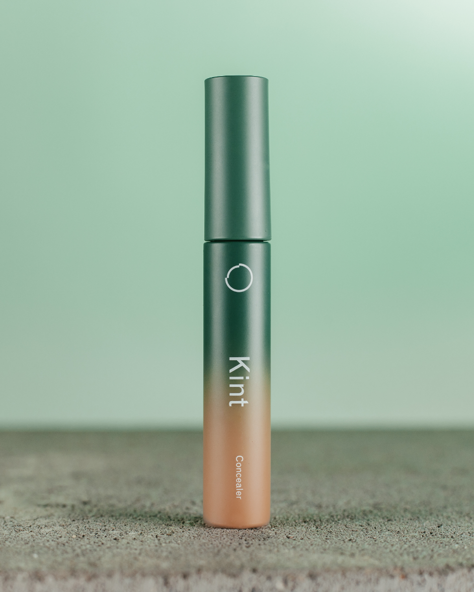
We worked with Kint since day one on their entire brand world. The name came from the japanese word ‘Kintsugi’ – the art of repairing broken pottery by mending fractures with precious metal lacquer – symbolising the beauty of imperfection. The mark was designed to highlight this idea, complimented by a wordmark that utilises a grotesque font: a type style defined by imperfect details.
Project Images


Navigation to previous or next project
Credits
- Jon Kallus
- Rose Gordon
- Tommy Seddon
- Sam Watts
- Rouse Creative