Shoal is a premium wellness brand designed to power modern, active lives. Bringing together high-performance hydration and community, the brand is an expression of Dubai’s progressive, active lifestyles, shaped by a landscape that is dramatic and often extreme.


Services & Details
- Strategy
- Naming
- Visual Identity
- Verbal Identity
- Digital
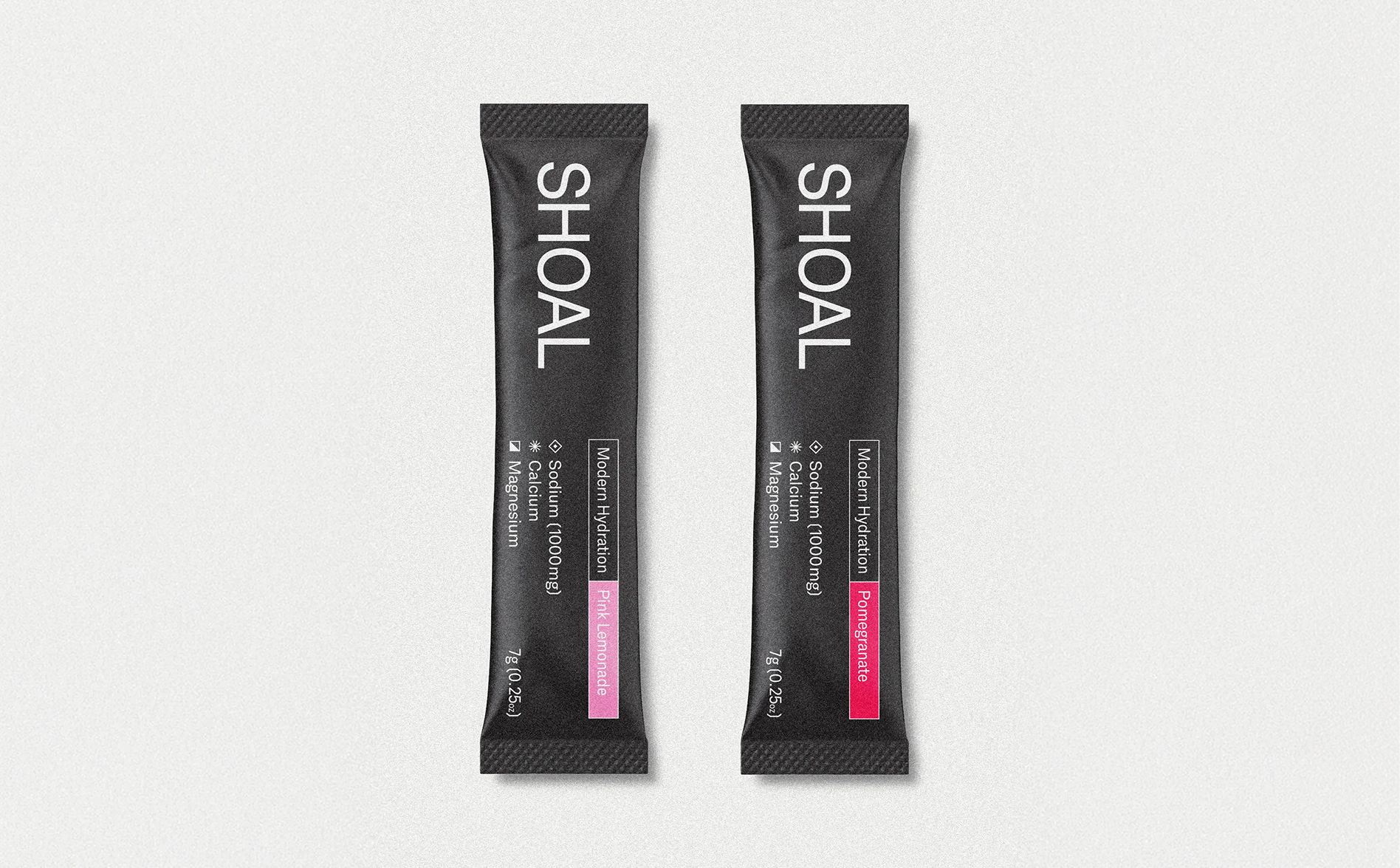
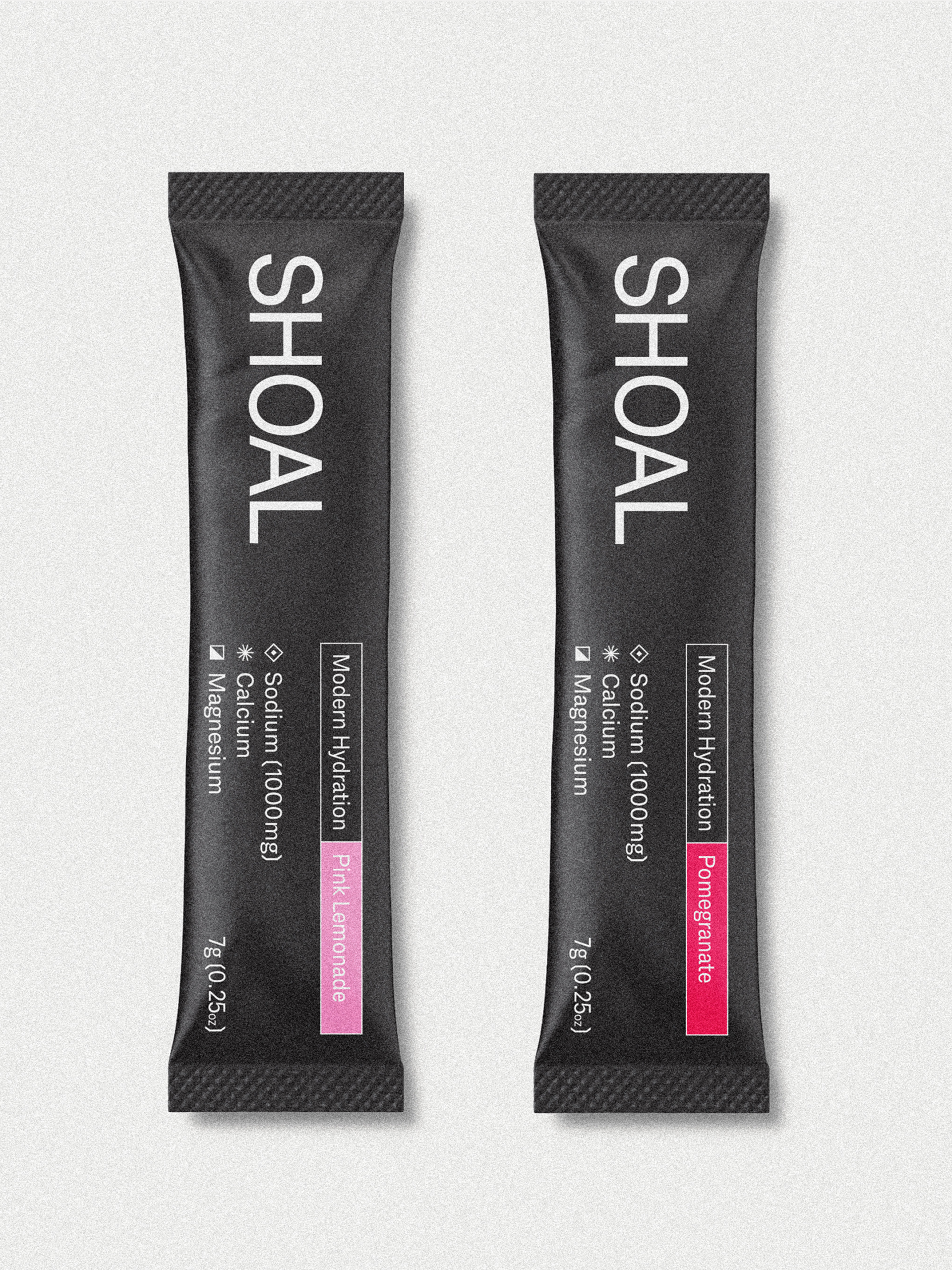
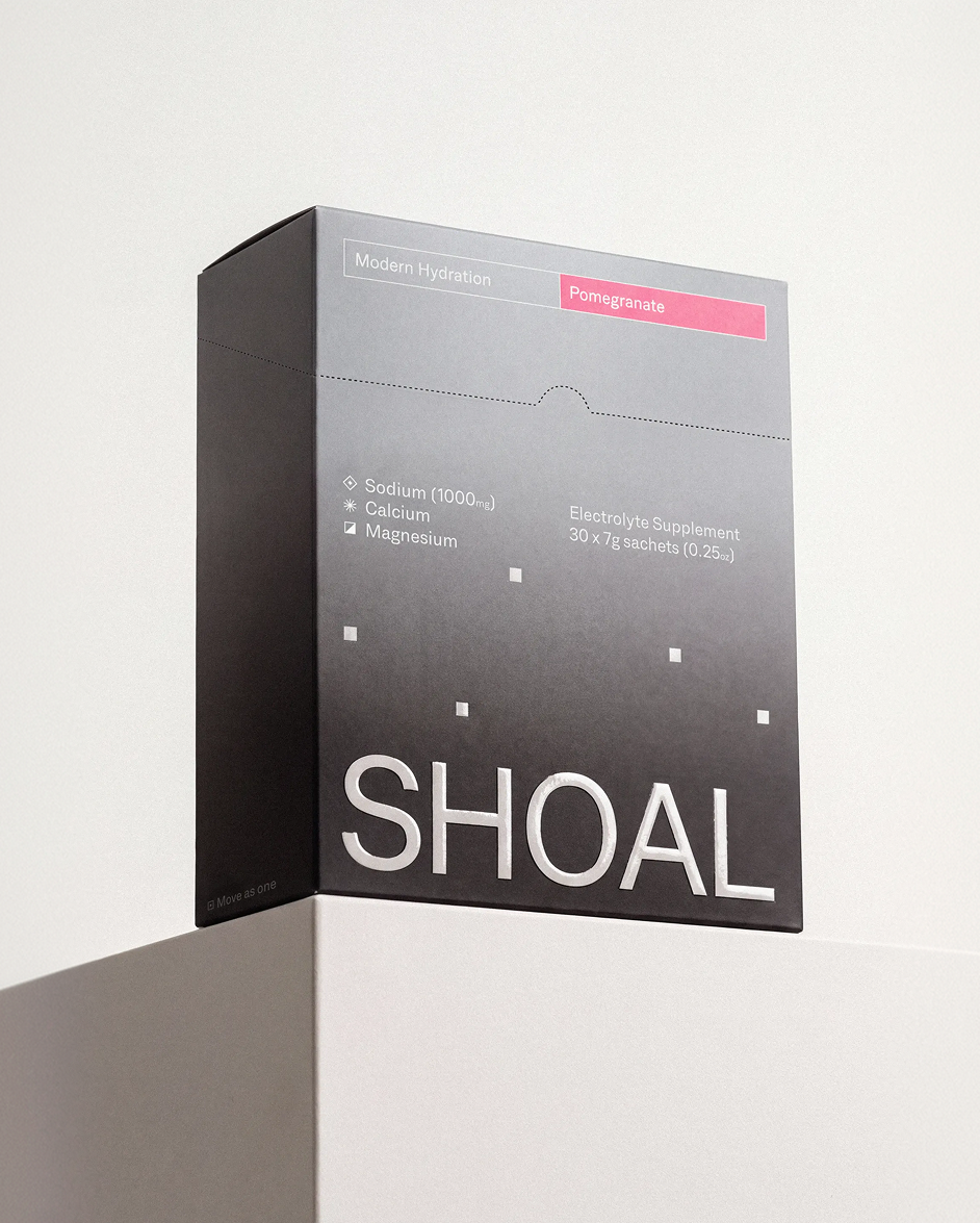
- Packaging
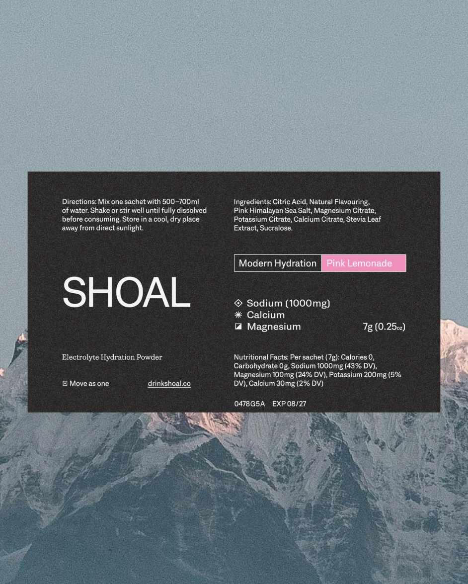
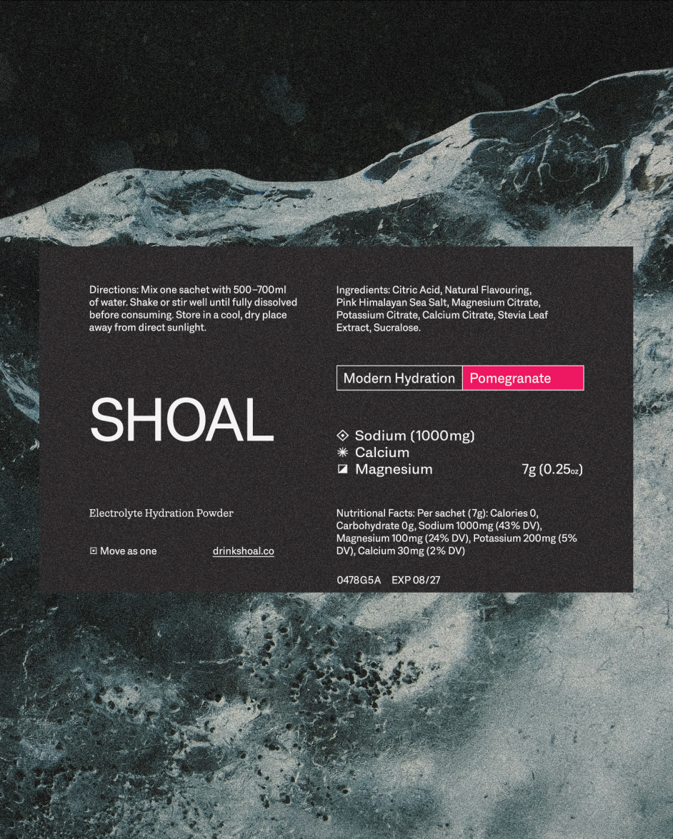
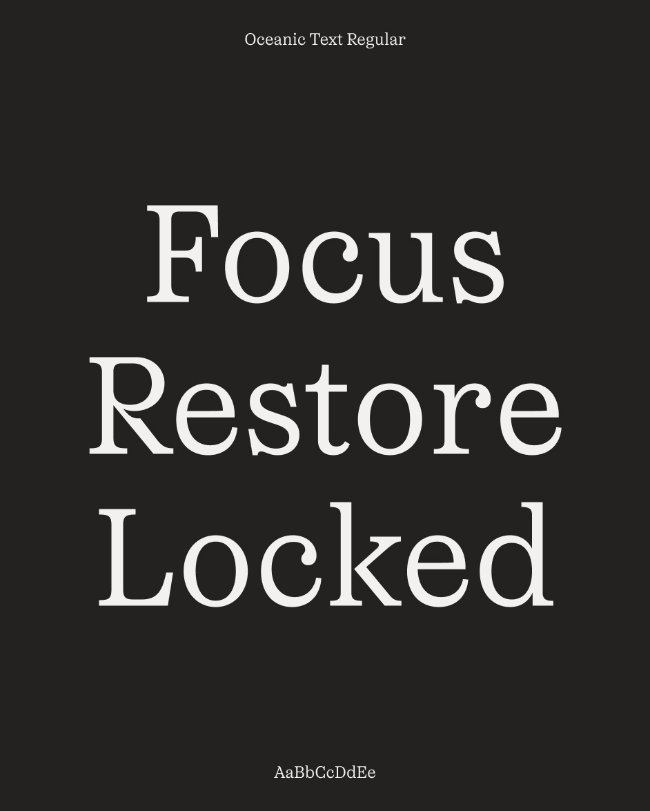
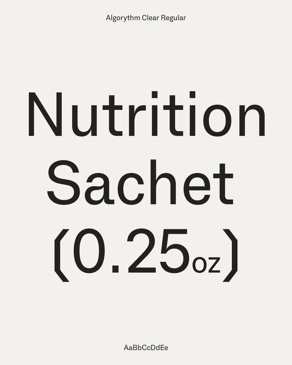
The name Shoal – how fish move together as one – is an expression of the connected flow of those groups. Typography sits at the centre of the design. The primary font, Algorytm Clear Regular, shows technical precision and features crystalline glyphs that provide a natural connection to the granular structure of electrolyte minerals. Supporting this is Oceanic Text Regular, an expressive serif font with liquid-like terminals and out-stokes.
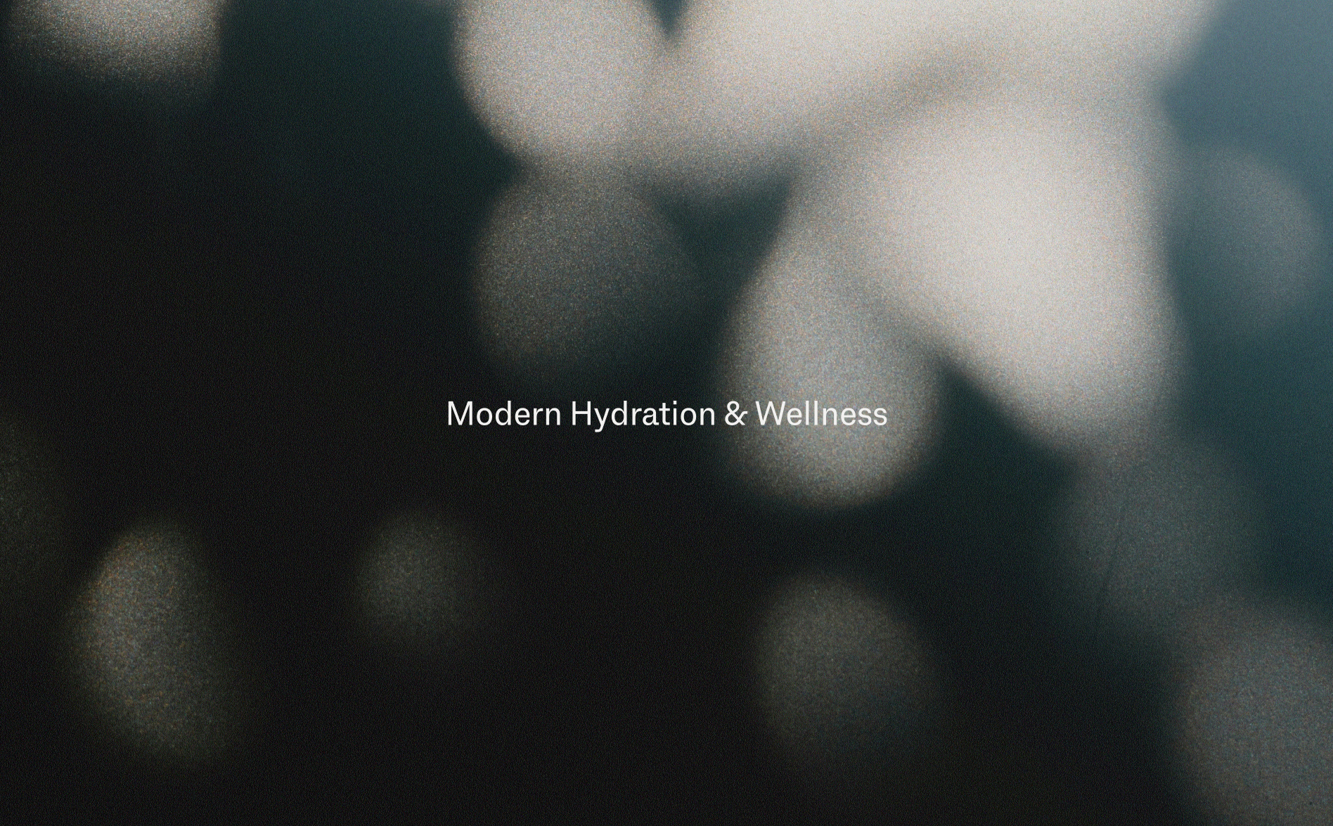
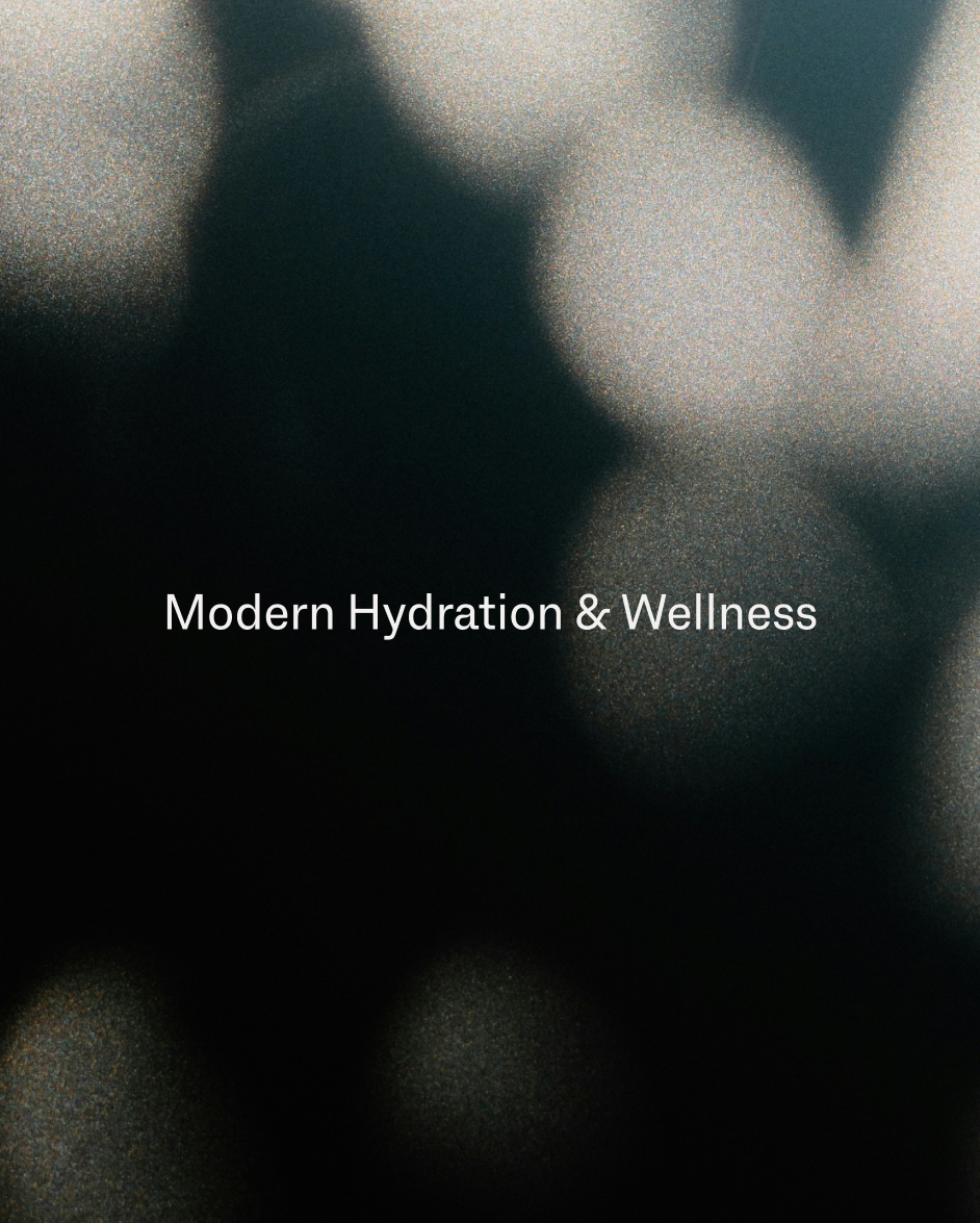
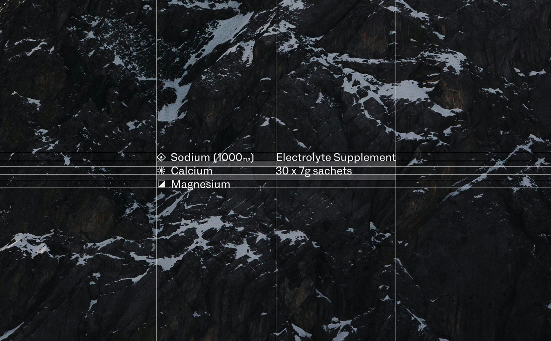
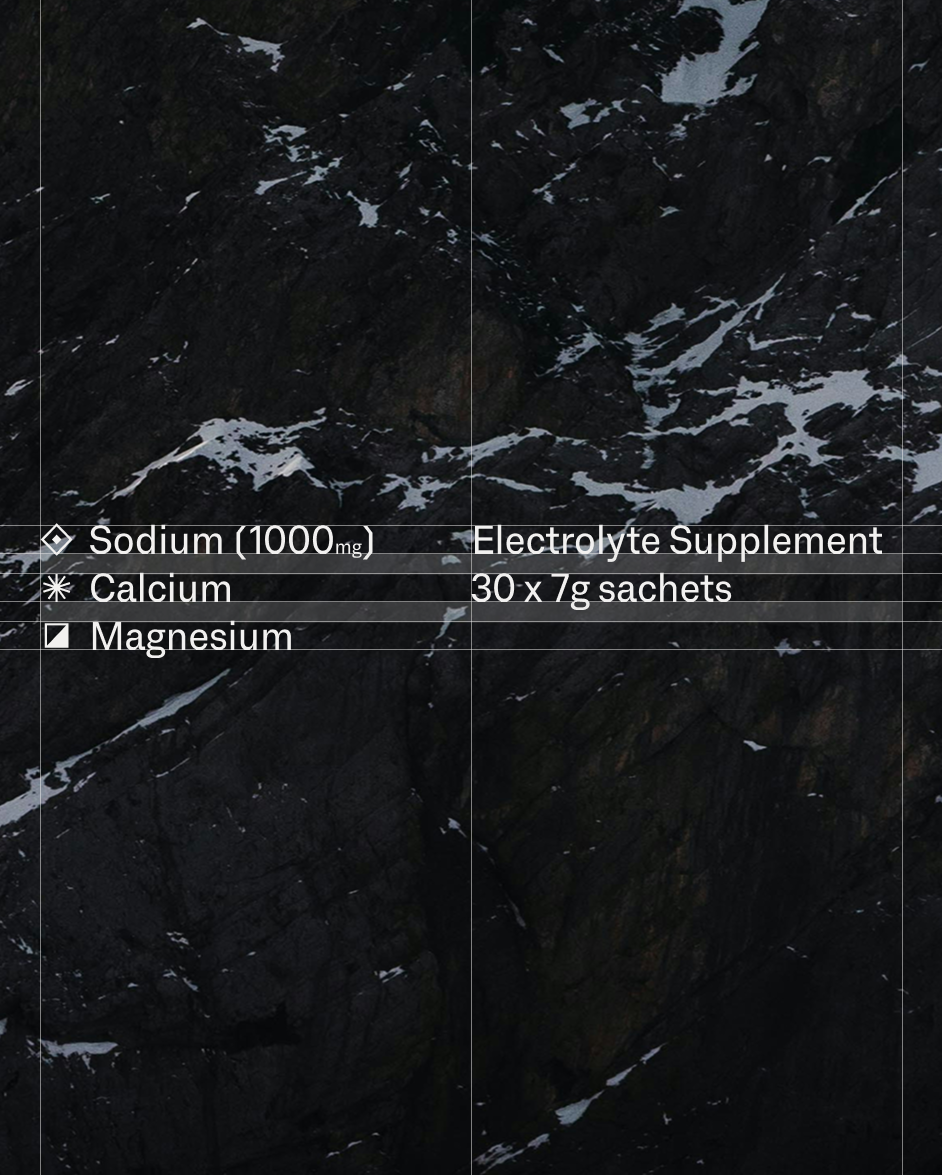
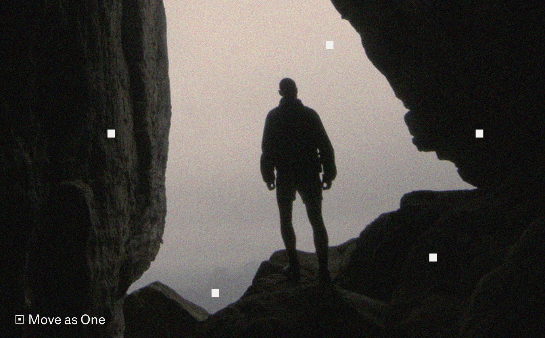
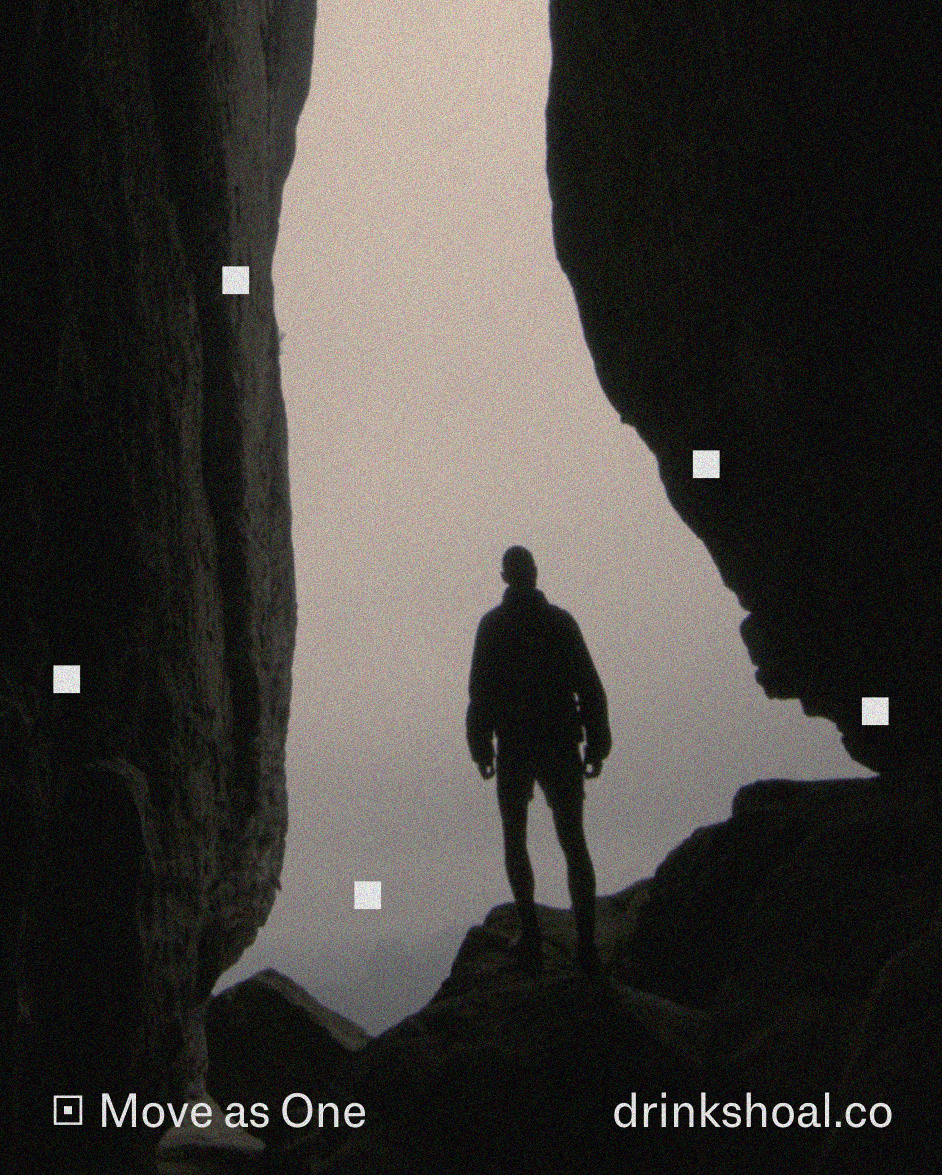
Another layer comes through five salt-like graphics (one for each letter of the wordmark) showing the minerals in synchronised movement. Art direction extends this idea into the world of Dubai’s people and terrain. Expansive landscapes and tactile grain create a visual language that feels grounded in the product. Colour brings a sense of place, with pomegranate and pink lemonade drawing on regional tastes. Shoal is an example of how a brand system can be achieved from a restrained set of ingredients.
Project Images
Navigation to previous or next project
Credits
- Rose Gordon
- Thomas Seddon
- Sam Watts