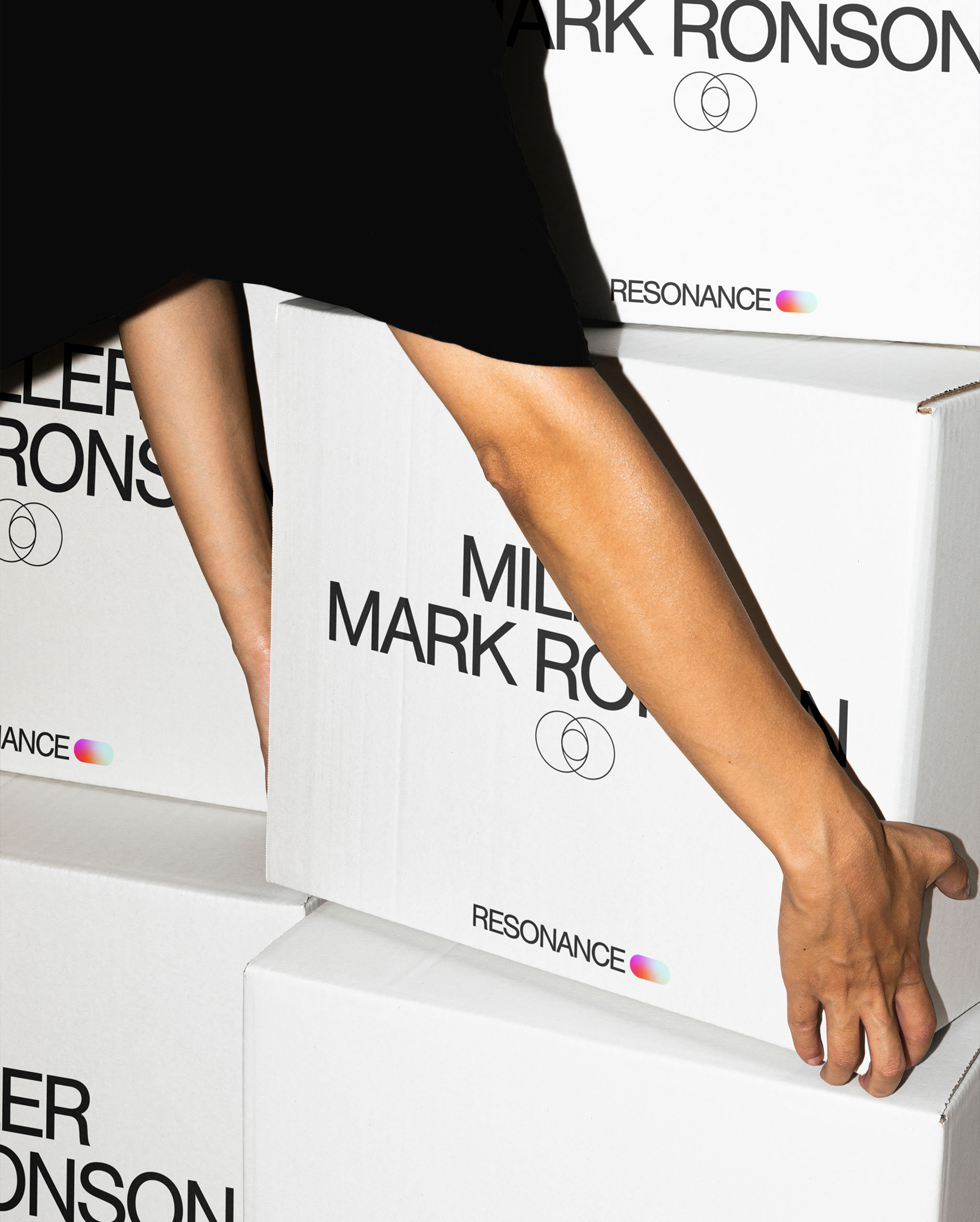
Resonance is a global partnership studio, specialising in branded entertainment. They create powerhouse partnerships that transcend culture; sparking the rare energy that erupts when authentic connections are made. We delivered a complete brand and digital evolution.
Services & Details
- Identity
- Entertainment
- Digital
- Female Founder
- Motion
- Social
- Brand Partnerships
The visual language depicts molecules colliding, resonating and giving off energy. A hybrid lozenge shape formed from 3 circles represents the elements of a successful partnership: Resonance, the brand, and the talent. This lozenge comes to life with an energetic gradient, it inhabits the brand language by framing typography and forms the basis of a family of icons. The result is an identity that communicates Resonance as a place where brands, teams and talent gravitate towards each other, releasing their unique creative energy on the world.
Project Images


Navigation to previous or next project
Credits
- John Jones
- Thomas Seddon
- Rose Gordon
- Mariana Barba
- Sam Watts